You might be surprised to know this – according to Digital Information World, 60% of people buying a new MacBook today are coming from Windows or Chromebook. I used to be one of them. And believe me, the switch felt both exciting and a little disorienting.
Back then, I kept looking for the Control Panel only to realize… it didn’t exist here. Instead, it had System Settings – the place where all your Mac’s essentials live. Maybe you’ve used a Mac for a while but need a reminder. Or you updated macOS, and things look different.
No matter which camp you’re in, my goal is to get you confident navigating System Settings! I’m going straight into what matters: what System Settings are, and where to find them. I’ll also explain the key settings you’ll actually use, options you can safely turn off, and give you practical tips on Finder and app settings.
This Article Contains
Beyond System Settings
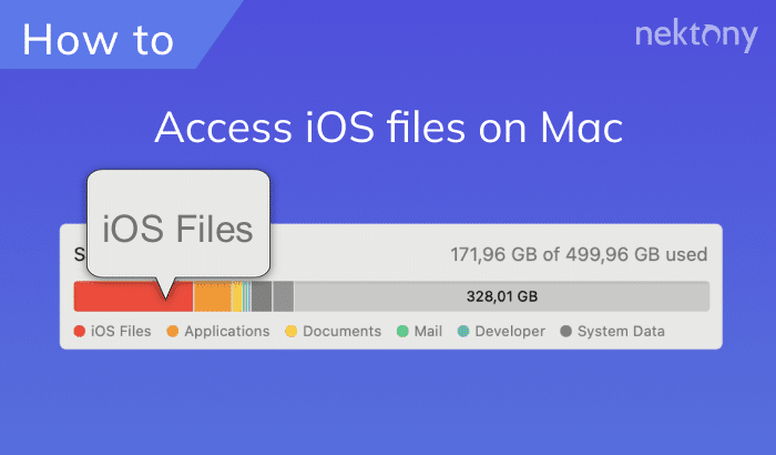
System Settings gives you a clear look at your Mac’s storage, but it doesn’t help much with managing or cleaning it. At this or that moment, you’ll need to go further – delete clutter, duplicates, cache, and organize space. MacCleaner Pro is made for that, clears the mess, gets your Mac a speed up, so you don’t have to worry about running out of room.
What are the system settings on Mac?
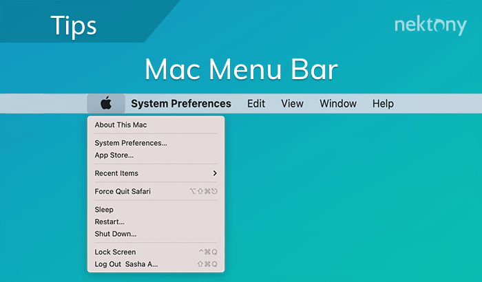
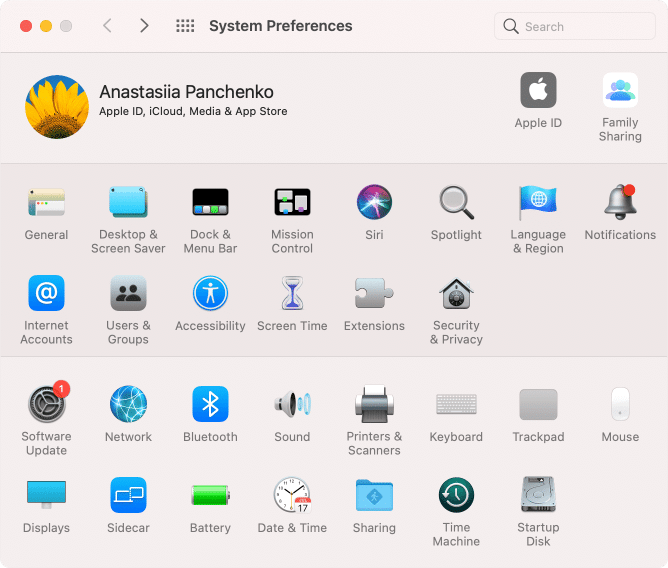
Every computer has a control hub where you adjust how it looks, sounds, and behaves. On Windows, that’s the Control Panel. On macOS, it used to be called System Preferences. If you’re on macOS Monterey or earlier, you’ll still see the old System Preferences window:
Note:
If it’s your case, for your Mac’s sake, update your macOS to get the latest features, fixes, and security updates.
Starting with macOS Ventura, Apple gave it a new name: System Settings. The design is also different. Making the experience more consistent between Mac and iPhone, it now looks much closer to the iPhone’s Settings, with a sidebar full of categories on the left:
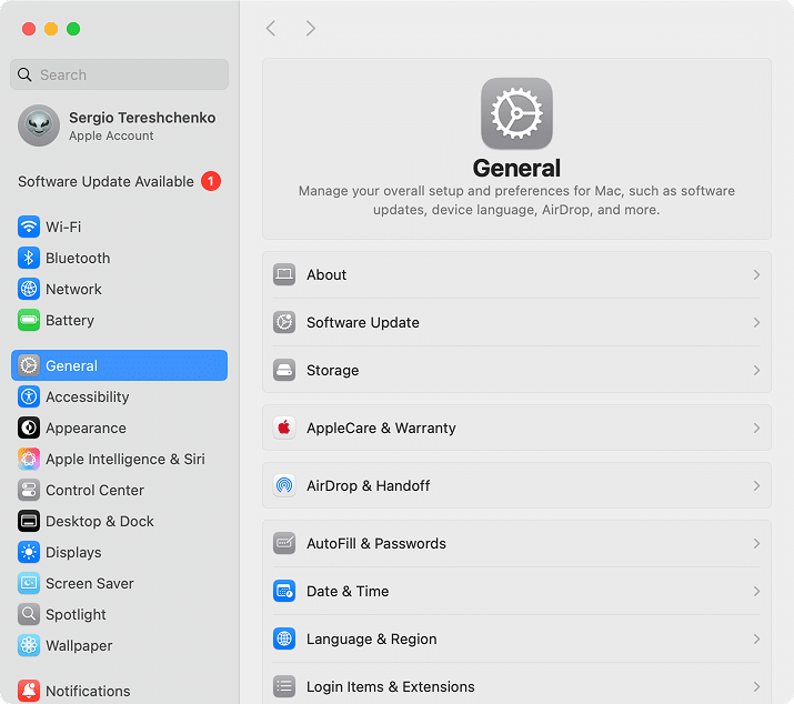
In System Settings, you can:
- Manage Wi-Fi, Bluetooth, and connected devices.
- Adjust privacy and security permissions.
- Customize the Dock, Menu Bar.
- Control Notifications and Focus modes.
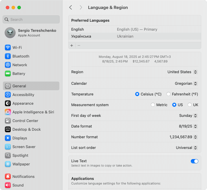
- Change language and region settings.
- Manage passwords and Keychain.
- Set your default web browser and email app.
- Tweak trackpad, mouse, and keyboard shortcuts.
- Manage login items and startup programs.
- Manage AirDrop, Handoff, and other Continuity features.
- Review your Apple ID, iCloud, and subscriptions.
- Set up Apple Pay and Wallet, and more.
Where are the settings on Mac?
There’s more than one way to get to System Settings – handy if your brain works differently on different days. You can reach them via Apple Menu, Dock, Finder, Launchpad, and Spotlight.
Ways to open System Settings
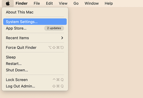
Option 1 – Use Apple Menu:
- Click the Apple icon in the top-left corner of your screen.
- Select System Settings.
Option 2 – Use Dock panel
- Go to System Settings using the Dock panel.
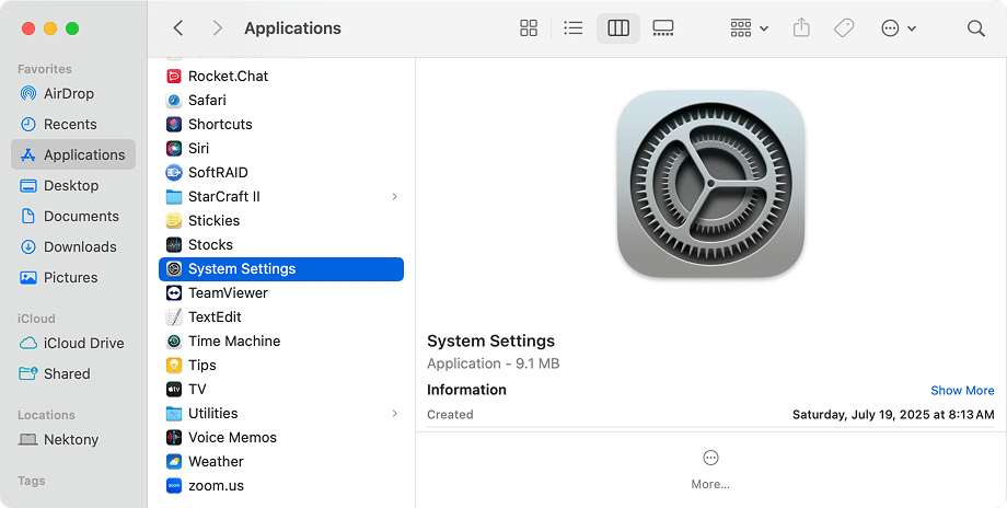
Option 3 – Use Finder
- Open Finder → go to the Applications folder.
- Locate and click System Settings.
Optional: Drag the icon to your Dock for one-click access, if it’s not there.
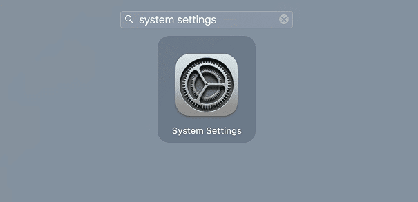
Option 4 – Use Launchpad
- Open Launchpad.
- In the search field, type System Settings → select System Settings.
Option 5 – Use Spotlight search
- Click the magnifying glass icon in the top-right corner of your screen.
- Enter System Settings and hit Return.
How to use System Settings on a Mac
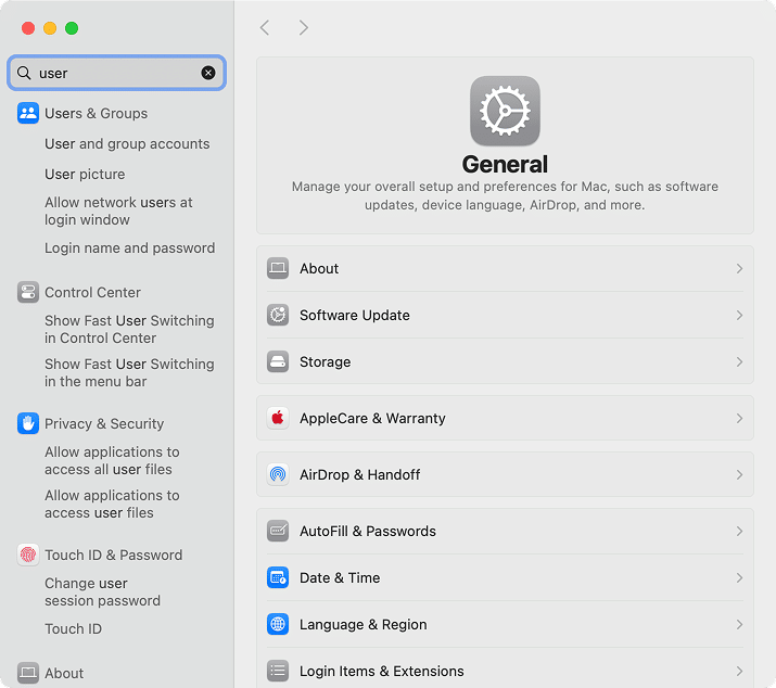
System Settings opens with a sidebar on the left and details on the right. Use the sidebar to move between sections, like General, Displays, or Privacy. If you can’t find a setting, type into the Search bar at the top – it will point you directly to the right one.
Exploring key Mac System Settings
System Settings is where you control your Mac’s experience. From the main window, you can manage your Apple ID, check for new software updates, storage, etc. Here are some of the most helpful settings, which I’ve broken down by categories in the left sidebar and described what you can do there:
Apple ID & iCloud
- Sign in or sign out of your Apple Account:
- Click the Apple Account at the top of the left sidebar → Sign in.
- Scroll down to the Sign Out button → click it to sign out.
- Enable features like Find My Mac, iCloud Drive, and Photos sync:
- Navigate to and select the iCloud tab → click the See All button in the Saved to iCloud section.
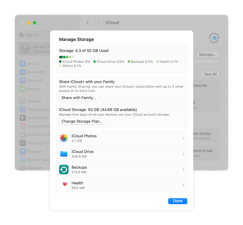
- Manage iCloud storage:
- Navigate to and select the iCloud tab → click the Manage button.
- Check out and remove your connected devices in the Devices section.
General
- Check your storage:
- Locate and click Storage from the right sidebar.
- Access Software Update to keep your Mac current:
- Locate and click Software Update → click the Check for Update, Update Now, or Update Tonight button.
- Check or customize your AutoFill & Passwords settings:
- Find and click AutoFill & Passwords → click the Open Passwords button to look through and/or change your passwords saved across the platforms.
- Set your Date & Time, Language & Region preferences.
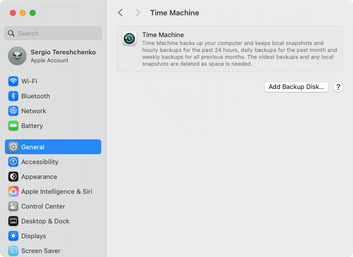
- Set up automatic backups to an external drive:
- Locate the Time Machine tab → click the Add Backup Disk button → select your drive → Set Up Disk.
Appearance
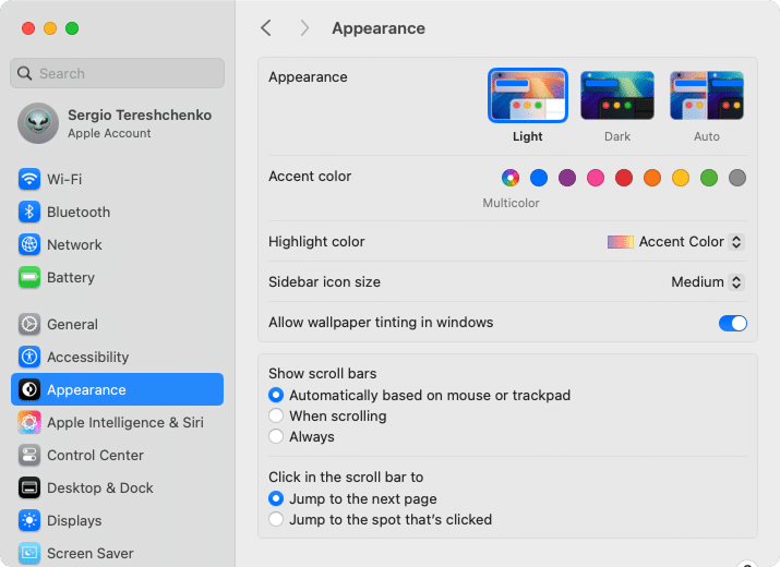
- Switch between Light, Dark, or Auto Mode.
- Change accent and highlight colors.
- Adjust sidebar icon sizes.
Control Center
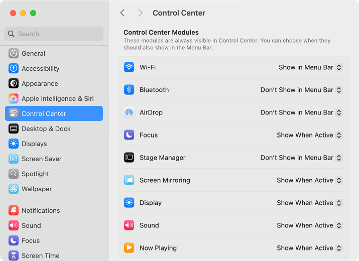
- Choose what shows in the Menu Bar (like battery percentage, Bluetooth, Wi-Fi).
Desktop & Dock
- Resize the Dock.
- Set the Dock to hide automatically:
- Locate and tick the Automatically hide and show the Dock option.
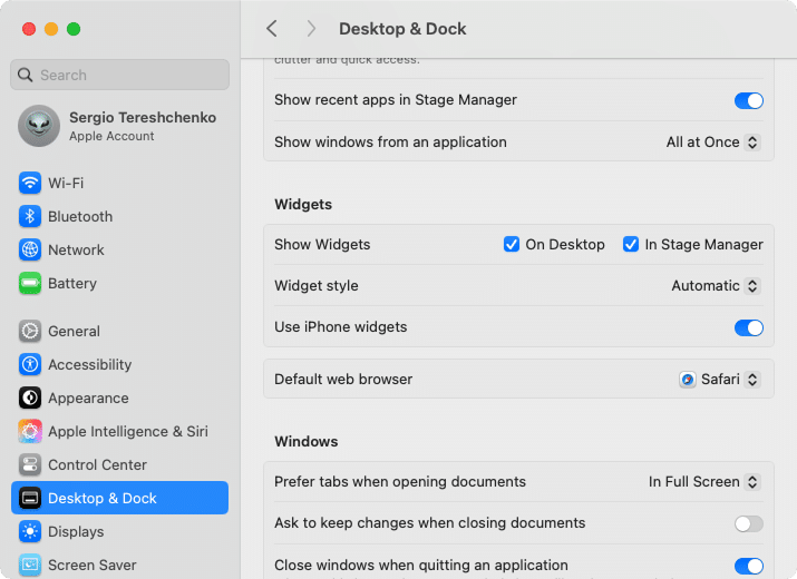
- Change the default web browser:
- In the Default web browser section, choose Safari, Chrome, or any installed browser as your default.
Displays
- Rearrange or manage multiple displays (drag to change position, choose which is primary).
- Adjust rotation (useful if you have a monitor mounted vertically).
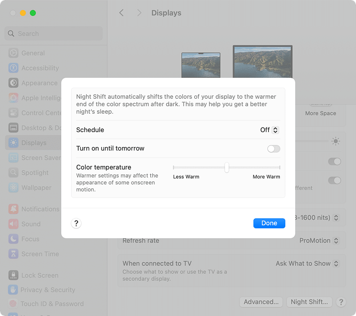
- Manage Night Shift (schedule, color temperature).
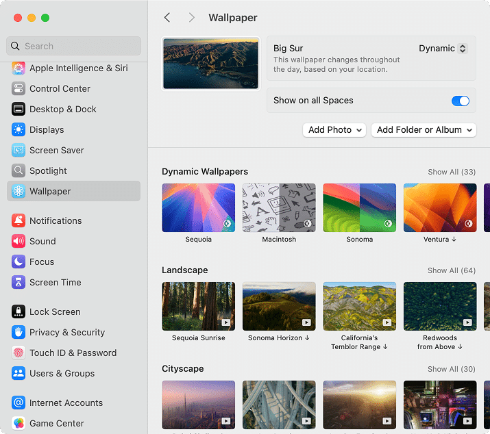
Wallpaper
- Change your desktop background:
- Choose a wallpaper from the given examples.
- Click the Add Photo to set your custom wallpaper.
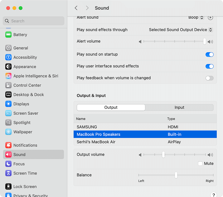
Sound
- Manage sound effects.
- Adjust your audio output and input preferences:
- Find the Output & Input section → select the desirable source from the list.
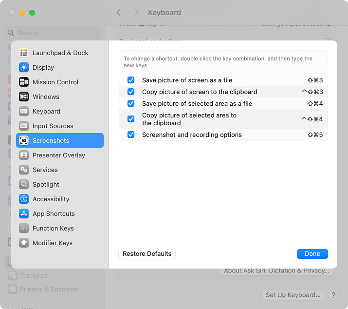
Keyboard
- Look for and/or create custom shortcuts (e.g., to make screenshots):
- Click the Keyboard Shortcuts button → go to Screenshots.
Trackpad
- Turn gestures (like swipe between desktops) on or off.
- Adjust click sensitivity.
Privacy & Security
- Control which apps can use your camera, mic, location, etc.
- Enable or disable FileVault (disk encryption):
- Find the FineVault option at the bottom → click it → push the Turn On button.
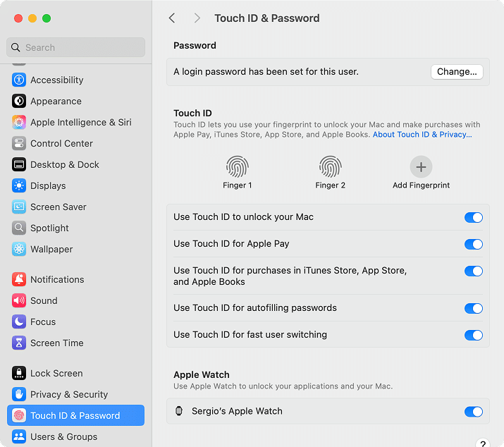
TouchID & Password
- Change a login password:
- Click the Change button under the Password section.
- Add fingerprints.
- Change Touch ID settings.
- Enable Apple Watch unlock.
Wallet & Apple Pay
- Manage payment details.
- Add a card:
- Click the Add Card button → follow on-screen bank instructions.
- Remove a card:
- Select the existing card → scroll down and click the Remove Card.
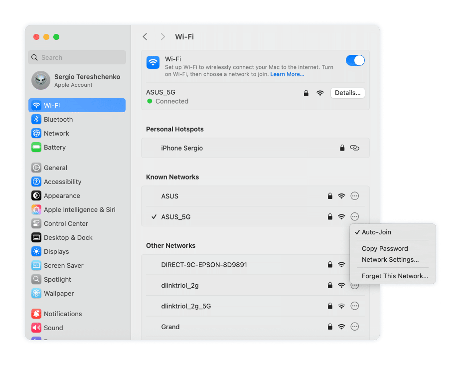
Wi-Fi
- Connect and manage networks.
- Copy the network password if previously connected:
- Click the three dots icon next to the network → Copy Password.
Bluetooth
- Manage Bluetooth settings.
- Pair devices.
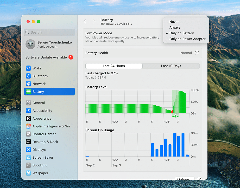
Battery
- Track your Battery health, charging, and usage statistics.
- Customize energy-saving settings:
- Go to the Low Power Mode section → open the dropdown on the right → select the Never, Always, Only on Battery, or Only on Power Adapter option.
Mac settings, you’d better disable
Some settings just get in your way, or even slow your Mac down. Here are some to check:
1. Remove Startup programs
Startup programs, also known as login items, are apps that launch the moment you turn on your Mac. Some of them can be useful. But when the list grows too long, your Mac has to load them all before you reach the desktop, which can make startup feel sluggish.
To turn off startup programs:
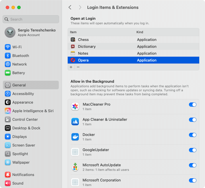
- Go to System Settings → General → Login Items & Extensions.
- In the Open at Login section, select the app → click the Minus (-) button.
2. Limit background app refresh
Some apps keep running in the background even when you’re not using them. While handy for things like email, too many can slow performance and drain battery.
To turn off background items:
- In System Settings, go to General → Login Items & Extensions.
- In the Allow in the Background section, toggle off a relevant app.
3. Disable notifications
Notifications are fine in small doses, but when every app wants your attention, it quickly becomes overwhelming. Not only does it break your focus, but those background alerts also nibble away at your MacBook’s battery.
To keep only the alerts that matter and silence the rest, do this:
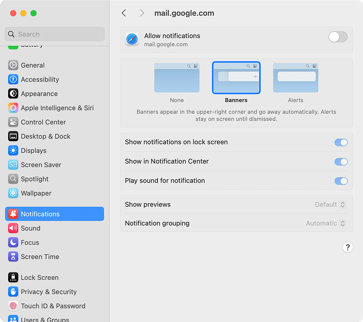
- Open System Settings → select Notifications.
- Select the app from the Application Notifications section.
- Next to Allow notifications, switch the toggle to off/on to disable/enable notifications.
4. Prevent apps from accessing your location
Many apps request your location, but not all of them really need it. Here’s how to take control and turn off location access:
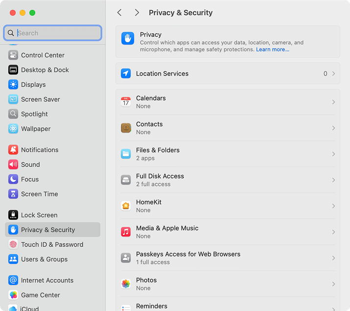
- In System Settings, go to Privacy & Security.
- Select Location Services.
- Toggle off any app you don’t want tracking you.
How to change Finder’s settings
Another thing you will use on a day-to-day basis is Finder. It’s like File Explorer, but on Mac. Every time you save, search, drag a file, browse documents, photos, downloads, and apps, you do it with Finder. With its settings, you can pick the default new window location, adjust which item to display, and set up views that keep your files easy to find.
Note:
Finder helps you access and locate files, but if your goal is to uninstall an application completely, App Cleaner & Uninstaller is much faster and more effective. It scans for all files related to any app and erases them from your Mac without the need for manual search.
A good thing is, Finder itself is customizable. With a few tweaks, you can set it up so it works the way you like – easier to navigate. Here’s how to get Finder’s settings:
- Open Finder.
- In the top menu bar, click Finder → Settings. (Shortcut alternative: ⌘ + ,).
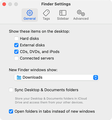
Now you’ll see a window with four tabs. Each one lets you adjust how Finder behaves:
- General tab: Decide what shows up on your desktop. You can also choose which folder opens by default whenever you start a new Finder window. For me, I like mine to open straight into Downloads.
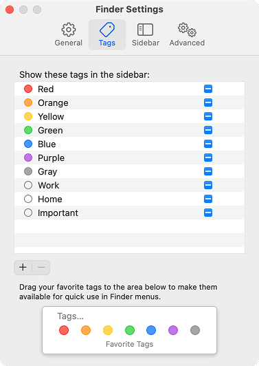
- Tags tab: Tags are a clever way to group files. You can color-code documents, photos, or projects, then call them up instantly. In this tab, you choose which tags appear in Finder menus so your favorites are always one click away.
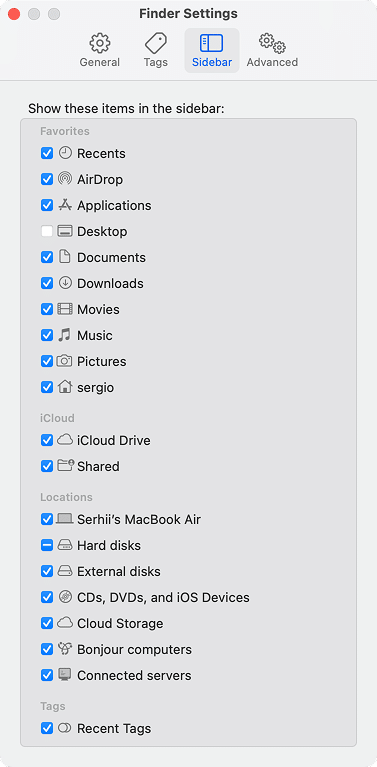
- Sidebar tab: This is your quick-access panel on the left. Here, you pick the folders and locations you want handy. Just tick the checkboxes for what you need, and they’ll pop right into your sidebar.
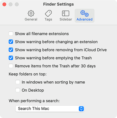
- Advanced tab: This one’s about the little details. Here, you can set a warning before you delete something, decide whether folders stay on top when sorting by name, and turn warnings for file actions (like emptying Trash) on or off. It’s also where you manage things like filename extensions and search behavior.
Pro tip:
There are files on your Mac that are invisible by default. If you need to reveal hidden files in Finder, hit ⌘ + Shift + . and they’ll appear. Press the same keys again to hide them.
Where to find application settings on Mac
Here’s the trick – not everything lives in System Settings. On macOS, apps keep their own settings built in. Here is how to find them:
- Open the application you want to adjust.
- In the top menu bar, click the app name (next to the Apple logo).
- Select Settings (shortcut alternative: ⌘ + ,).
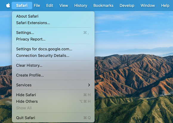
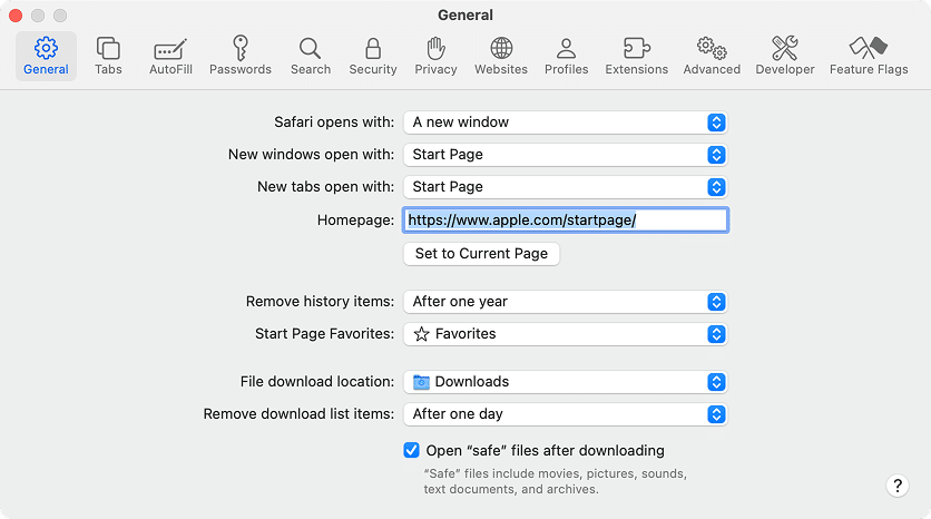
In Safari’s settings, you can set the default search engine, change your homepage, control privacy settings, choose where downloads go, manage extensions, and more.
Final statement
Congrats on mastering your Mac’s System Settings! With System Settings, Finder, and app settings under your belt, you can shape macOS and tune it to your style. Now, you have almost everything to optimize your Mac.
The last thing is, you’ll have to delete caches, duplicates, and applications earlier or later. Do yourself a favor: use MacCleaner Pro bundled with tools for all occasions to make your app deletion, cache and duplicate clearance, and other Mac optimization routine simple and four clicks away. Download this tool with a free trial and without second thoughts.

